Showing posts with label ui. Show all posts

Thursday, January 23, 2014

How to Code an Elegant Breadcrumb Navigation Menu With Arrows (using only CSS)

So, you want a great-looking, flat-design, arrow-like breadcrumb navigation? Something withoput images? Look no further!

This is what it will look like
Let's dive into:

Let's start with a simple navigation item, with links inside. We will need some extra HTML. Hence, we will insert three <span>s into each <a> element. One for the upper half of the link, one for the lower half, and one for the actual content.


<nav class="navigation">
    <a href="/start" class="active">
        <span class="upperArrowElement"></span>
        <span class="lowerArrowElement"></span>
        <span class="content">Getting Started</span>
    </a>
    <a href="/start/signup">
        <span class="upperArrowElement"></span>
        <span class="lowerArrowElement"></span>
        <span class="content">Sign Up</span>
    </a>
    <a href="/start/signup/enjoy">
        <span class="upperArrowElement"></span>
        <span class="lowerArrowElement"></span>
        <span class="content">Enjoy</span>
    </a>
</nav>

The magic happens, when we insert the right CSS. I would like first to describe, what actually happens:
We will use some fancy CSS properties to style first and second <span> to look like the arrow. The content will be displayed via span.content . The first element will need some extra style so that is has an straight vertical border.

So, let's start with the CSS:

nav {
    font-size: 13px;
}

.navigation a {
    display: block;
    position: relative;
    float: left;
    height: 32px;
    box-sizing: border-box;
  
    margin-right: 2px;
    margin-bottom: 5px;
  
    text-decoration: none;
    font-family: sans-serif;
    color: #333;
}

We will need to position the children elements by position:absolute. Because we don't want to position the arrows relative to the navigation menu, but relative to each link item, we need to set position: relative; . Another important value, that should be set is (suprprise!): height. If we set height so an uneven value, there might be ugly artifacts in some browsers (I will explain later).

Now let's go to the next point: The real arrow stuff (Hooray!)

.navigation a > .upperArrowElement {
    display: block;
    width: 100%;
    height: 50%;
    position: absolute;
    -webkit-transform: skewX(35deg);
    -ms-transform: skewX(35deg); /* IE 9 */
    transform: skewX(35deg);
    background-color: #E5E6E8;
}


This is the part where the real actions happens. We set the width to 100% and height to 50% and set the position to absolute (Therefore we need to set position of the parent element to relative).  We transform the the upper element by transform: skewX(35deg); This forms the upper part of the arrow. We really should set the height of the parent element to an even pixel number, because Firefox and Internet Explorer will leave some sort of half-pixel transparency on the top and bottom edge of the .upperArrowElement if you use skewX. The lower part, we handle analogously: We transform the bottom part in the opposite direction and position it at the bottom part of the link.

.navigation a > .lowerArrowElement {
  display: block;
  width: 100%;
  height: 50%;
  position: absolute;
  bottom: 0;
  -webkit-transform: skewX(-35deg);
  transform: skewX(-35deg);
  background-color: #E5E6E8;
}

We position also the content:

.navigation a > .content {
  display: block;
  padding: 0.5em 1.3em;
  position: relative;
  top: 0;
  left: 0;
}


When we look at the navigation bar, it looks like this:

Without straight vertical line
If you like it, you're done. But if want the vertical line, you need a little bit more CSS. But don't fear, you won't need any additional markup.

.navigation a:first-child > .content {
  left: -2px;
}

We should slightly move the content of the first link. It will look better. Trust me.

.navigation a:first-child::before {
    content: '';
    display: block;
    position: absolute;
    background-color: #E5E6E8;
    height: 100%;
    width: 50%;
    top: 0;
    left: -5px;
    z-index: -1;
}

Some explanation: We add an element to the first a. We position on the a little bit to over the left edge of the parent element and make it below the parent a (oh, yeah this is another reason we need to position the parent a: to make the z-index property work).

Aaaaand we're done! Here's the complete code, including live demo The beauty of this approach is manifold:
  • We need no images. Especially for people who don't know Photoshop, GIMP this is a big plus.
  • We need no images. Want the arrows a little bit shaper? Just change the angle. Move the ::before block a little bit to the left. Just some keystokes and you're done. Compare that to your Photoshop image replacement.
  • This is my favorite part: Hovering on the arrow links is pixel perfect. I haven't found that on the internet yet. Not even on hongkiat.com (which is usually great for such stuff).
  • Did is say, we need no images? Design in browser. Be awesome.

Wednesday, January 15, 2014

If you can undo it, don't bother me.

Yesterday I had a discussion with an usability expert about a web interface.
The interface we were discussing was a dashboard control panel. You could delete some things. And every time you wanted to delete one of those thing, the interface would ask you something like "Are you sure?".

The root so so much evil.

We're all been there once: We click the "Delete" button on some program, and just a fraction of a second after we confimed that annyoing "Are you sure?" question, we realized, that we actually wanted to keep it. We blame yourself for being so stupid or get a nervous breakdown because we just deleted the presentation we worked on for the last three weeks.

But we should not blame ourselves. It's not our fault, it's our software's fault. The software does not respect human nature. Humans are built to learn, to adept. Therefore we develop habits. We can't do anything about it. That's how we are.
Every time we do something repeatedly, we learn. In some cases, we learn to that point, until we don't think about it anymore. This is actually a good thing: Because of this behavior we can be more aware to the new stuff happening around us. This becomes a problem when software expects us to mindfully reflect each thing we do. After clicking 1000 times "Yes", (because in most cases, we indeed are sure, that we want to do this shit.), we don't think about it anymore. Hence someday, almost for sure, we will make an error by clicking "Yes", although we actually meant "Hell, NO!"

The average user's reaction after deleting something accidentaly 

What should you do instead?

Offer a undo mechanism. If a user clicks on that delete button, delete that selected item. But make it recoverable. Instead of asking every time whether the user is sure, just do it and offer a possibility to recover from that one time he mistakenly clicked on that button.

I guess the most know example to this might be Google Mail. I heard, Jolla Phones do that. And it's just great. In most cases, offering an undo mechanism will make you app faster to use and hence more fun. And most importantly, it will reduce the errors users make dramatically.

That's how you do it.

So what are the rules?

Your users' data is sacred.

Know that each user interface shapes habits. You cannot avoid that users create habits.Create a user interface, that makes each error recoverable. So for every error you can foresee: Make it recoverable.

Your users' attention is sacred

Don't annoy the user with the same dialogs over and over again. And make the the dialogs as unobstrusive as possible.

Your users' time is sacred

Don't make the user type or click anything more than absolutely necessary. Confirming the action he's doing is not necessary if you can provide an undo. So don't waste you users' time by making him click.

Friday, September 20, 2013

Google on the way to minimalism

I just was surprised by the redesign of the the Google Pages. I'm just enjoying that they realised, that a single, long black row above all might not be the best for screens with an 16:9 ratio, where vertical space is crucial.

So they moved the top bar into a small button on the right side. I like it. Period.
But I already see the downside of this approach: If you wanted to use some rarely used searches, e.g. Videos, you'll need twice as much clicks to reach it: four instead of two. Google might reconsider it.

Need some whitespace?


Monday, April 8, 2013

Some Buttons

Today, on the train, I was tired, bored, had no internet access and was not motivated to read anything. So I coded something I wanted to try long time ago:

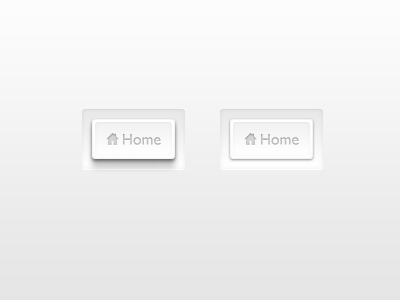
To put this great UI photoshop comp (as seen on Dribbble) into HTML:

clean design *sight*
After hitting the Starbucks in Cologne, I had some Internet, so I could verify that my memory of this design was right and after finding the last missing tutorial (I needed it for that inner shadow on the text), i finally came up with this:


Link: http://loie.de/ultraclean/

Tradeoff: This currently works only in Webkit, due to the inner shadow of the text.

Feel free to grab the code.


Saturday, October 6, 2012

Register and Login reworked

Hi everybody!

I was working most of this saturday to create the new register page on the bibel reading plan web app. I had to drop the beautiful book cover background image, beacuse it was just a mess to work with on so many different resolutions, screen sizes and devices. And it did not provide a good legibilty. So I had to replace it back with a simple repeatable background.

Here are the results. I even borrowed a friend's iPhone to make some pictures. Yeah.


Register page on iPhone

Updated Login page on desktop Browser

Register page on desktop browser


Saturday, October 8, 2011

Intro Page With Benefits

Hi. I'm Lorenz. And today I started this new blog. The purpose of this thing here is to show some design and coding stuff i'm working on now - or I worked some time ago. Or just some stupid ideas that wander through my head.

For the first posting i would like to present a sort of "intro page with benefits". Some historical stuff, since I would not recommend using an intro page anymore. But hey, it's kinda cool anway, isn't it?

"Check this out" - links to myspace and newsletter stuff on intro page

The enter button